MyLOLA

Role:
Freelance UX Designer
Duration:
1 year (on-going freelance)
Contribution:
Research, design, concept
Platform:
Web
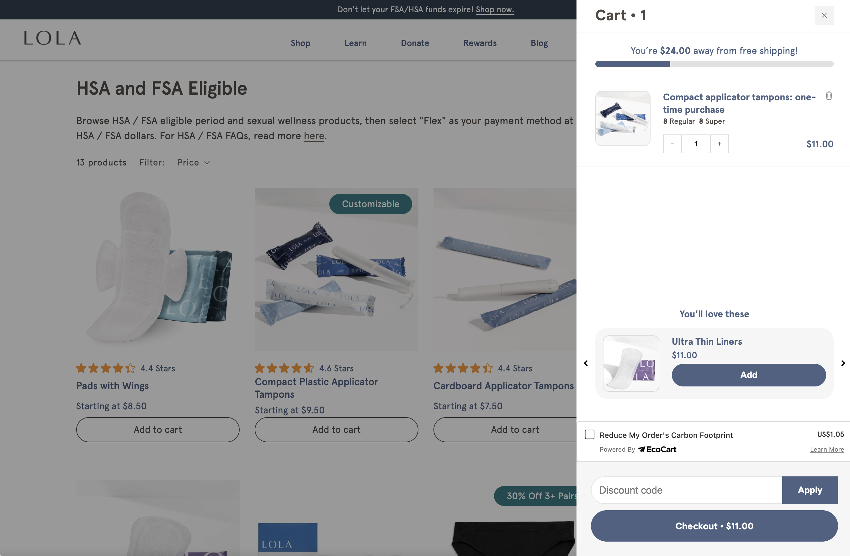
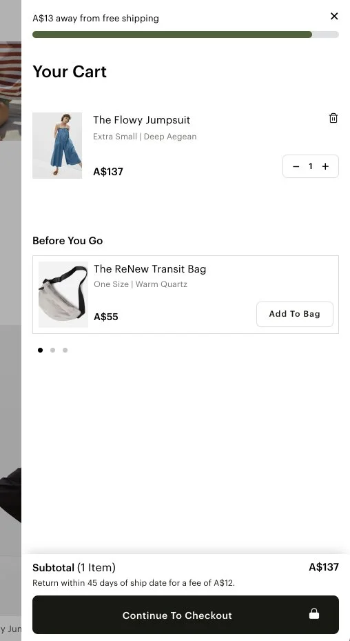
LOLA recently re-platformed its website to a headless architecture, moving away from Shopify as a hosted platform. This shift unlocked greater design flexibility and created an opportunity to rethink key commerce experiences, starting with the cart.
As part of the redesign, we introduced dynamic functionality tied to the $25 free-shipping threshold. When users exceeded the threshold, the cart clearly confirmed free shipping; when they were below it, the cart surfaced a real-time progress indicator showing how close they were to qualifying. Post-launch analysis showed a 12% increase in cart completion, a 9% lift in average order value, and a 17% reduction in cart abandonment, indicating that clearer feedback and incentive visibility helped users make faster purchase decisions.
Discovery
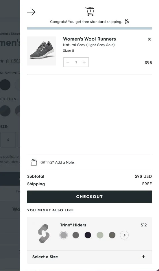
The discovery phase focused on understanding both the competitive landscape and the existing myLOLA cart experience. I conducted a comprehensive audit of the current cart flow to identify usability gaps, friction points, and missed opportunities across messaging, hierarchy, and incentive visibility. In parallel, I performed a competitive analysis of direct and adjacent e-commerce brands to evaluate how others communicated free-shipping thresholds, handled cart feedback, and encouraged conversion.
Insights from this work revealed that competitors were more effective at using progress indicators, contextual messaging, and clear visual hierarchy to guide users toward checkout. These findings helped clarify where myLOLA’s experience was underperforming and directly informed the redesigned cart strategy.
Exploration
During the exploration phase, I worked through multiple design directions and layout variations for the myLOLA cart experience. This included experimenting with different approaches to incentive messaging, progress indicators, information hierarchy, and interaction patterns to understand what best guided users toward checkout. Each concept was translated into high-fidelity prototypes and iterated across visual and UX explorations before being validated through unmoderated testing.
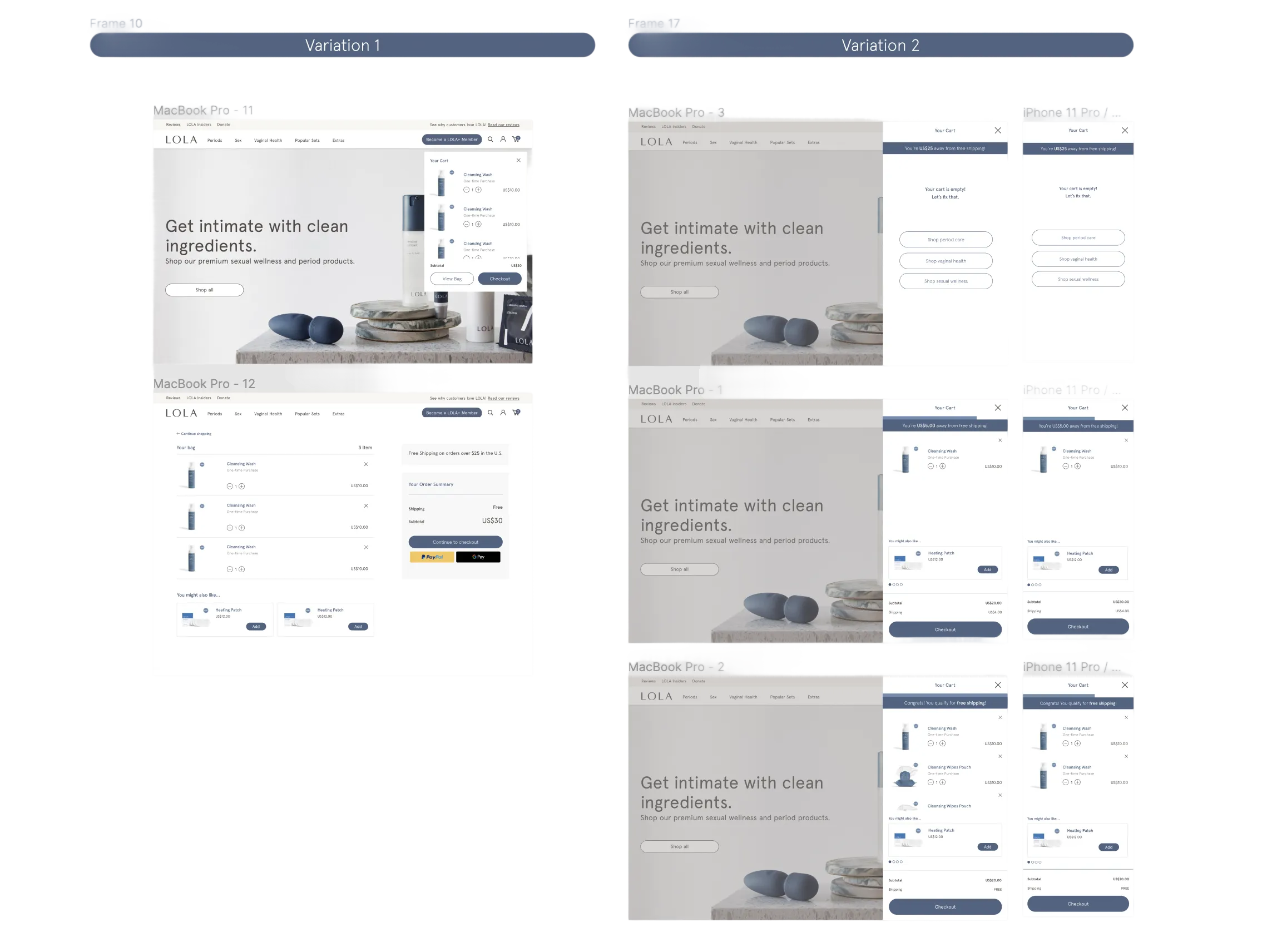
Final design