Kate Szmurlo

Therabody

Product Listing Page

Role:

Freelance UX Designer

Duration:

1 year (on-going freelance)

Contribution:

Research, design, concept

Platform:

Web

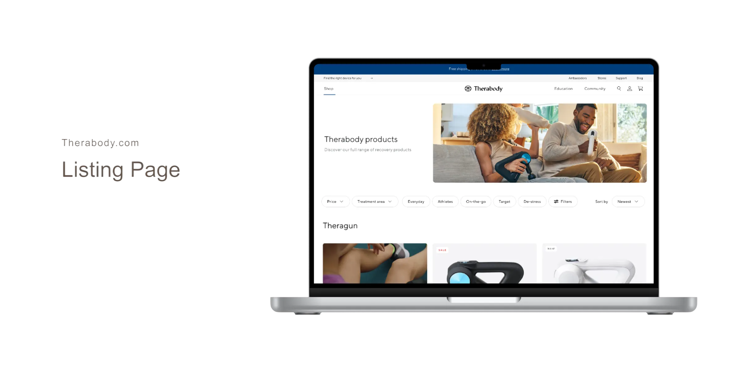
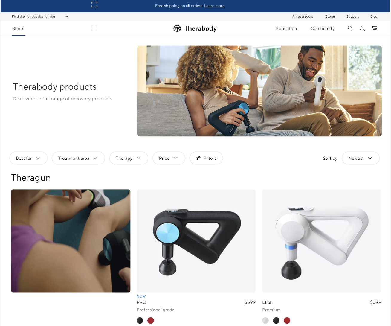
The Therabody design team set out to explore new and innovative ways to improve the product listing page shopping experience. As Therabody expanded from a single hero product into a multi-product ecosystem—growing beyond the core Theragun line to include additional devices and accessories—the existing product listing page no longer scaled with the business. This growth created a need to rethink how products were organized, discovered, and compared as the catalog continued to expand.


I served as the lead designer on the exploration, partnering closely with a design researcher. Together, we ran a series of usability tests on UserTesting.com, evaluating both the existing experience (control) and new design concepts to validate improvements and guide iteration.User research surfaced several key gaps in the current experience:

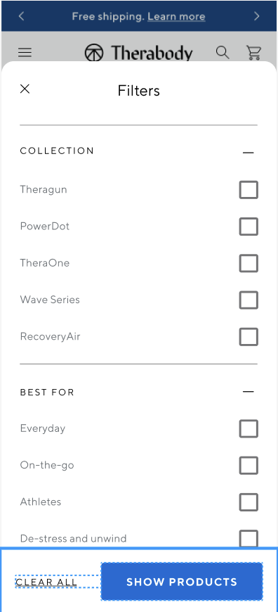
  • No ability to search or filter products by body part or pain area
  • Lack of in-context visuals or videos showing products in use
  • Product overload as the catalog expanded, making it difficult to choose
  • No clear way to compare products and understand differences at a glance

Discovery

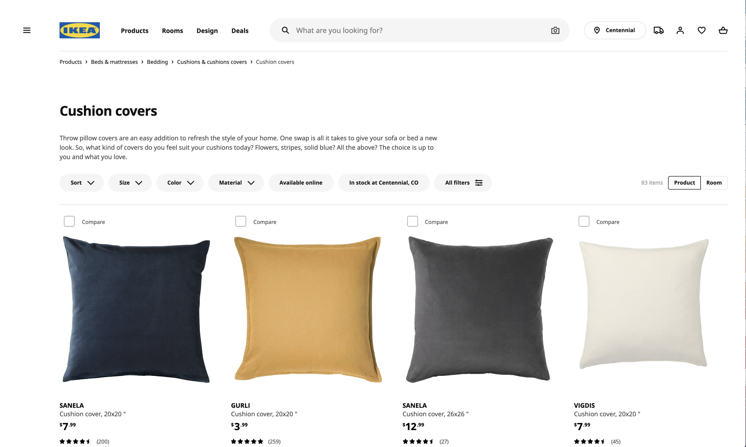
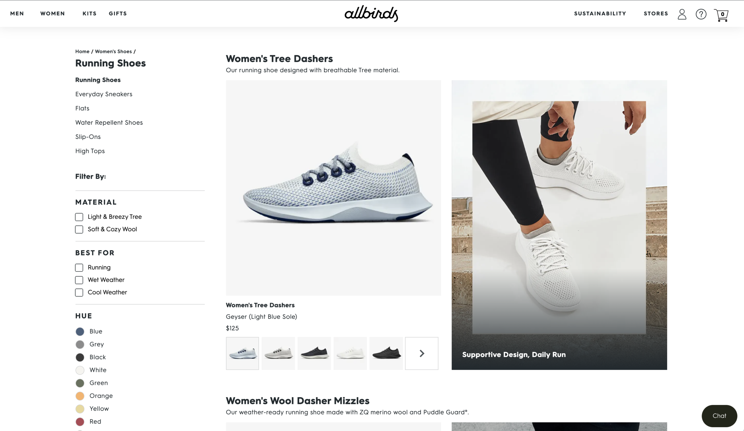
The discovery phase focused on understanding how other leading brands approach product discovery and decision-making at scale. I conducted an extensive competitive analysis across fitness, wellness, and adjacent e-commerce spaces to evaluate how competitors structured product listing pages, supported comparison, surfaced education, and reduced choice overload. By identifying common patterns, gaps, and best practices, this research helped clarify where Therabody’s experience was falling short—and where there was an opportunity to differentiate through clearer navigation, better storytelling, and more intuitive product comparison. Insights from this analysis directly informed early concepts and set a strong foundation for design exploration.

Research

I led the research efforts for this project, independently designing and executing multiple studies on UserTesting.com. This included building out research plans, crafting study objectives and questions, and setting up unmoderated interviews to evaluate both the existing experience and new design concepts. Insights from these sessions helped identify user pain points, validate design direction, and guide iteration throughout the exploration.
  • Finding 1
    Wants to see the benefits and treatments upfront
    • Most, if not all, got frustrated over not knowing clearly what the treatments and benefits were
    • Felt like the page was trying to sell them on the lifestyle more than what you get out of the product
    • Wanted to see clearly what they were buying it for
  • Finding 2
    Would like to see testimonials or reviews

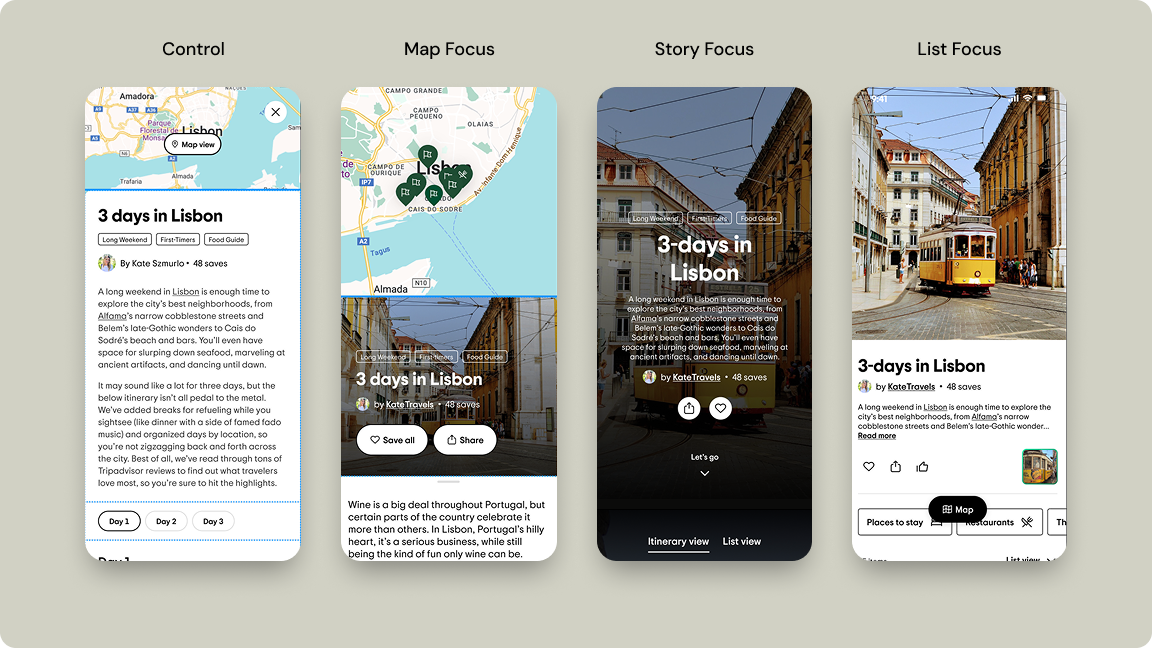
    Participants were really impressed by how visually engaging the story focused concept was.


    When asked if they would be wanting to create something like this, half said they would but the other half said writing isnt for them and they would be the reader.

  • Finding 3
    On mobile, users thought it was too long of a scroll and too many images
    • The scroll on mobile becomes dramatically long
    • Many would get fatigue from scrolling so long
    • Because it was so many images, it made it impossible to scroll
    • Images were nice, very diverse, but extremely repetitive

Detail page

Role:

Freelance UX Designer

Duration:

2 weeks

Contribution:

Research, design, concept

Platform:

Web

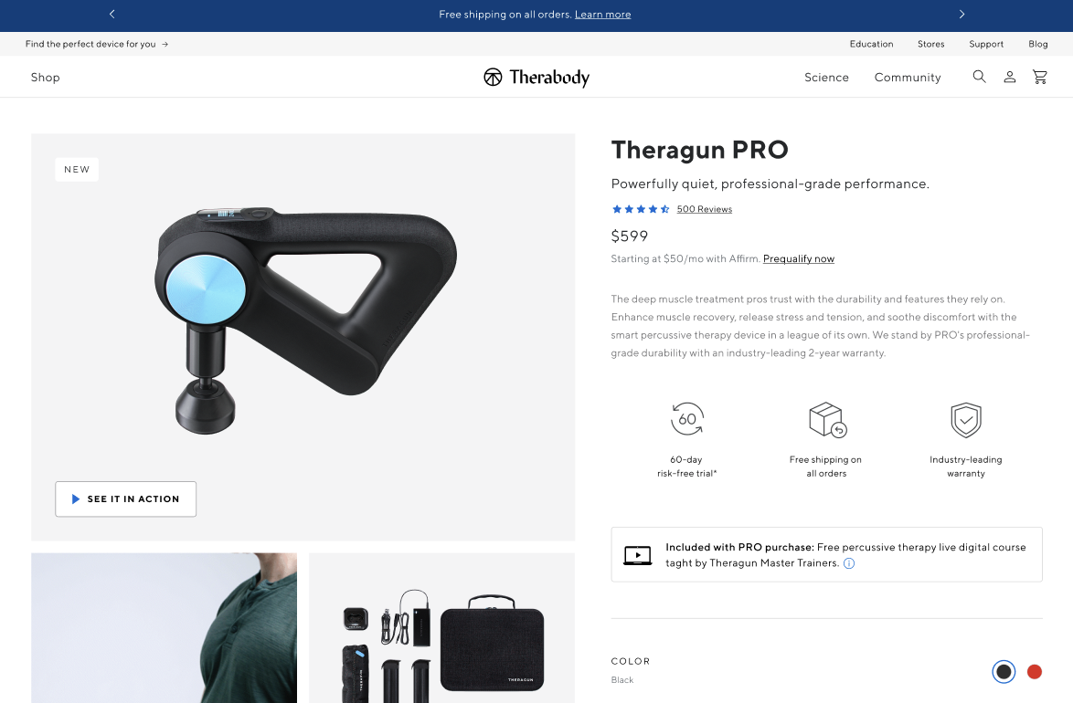
The Therabody design team set out to explore new and innovative ways to improve the product detail page (PDP) shopping experience. As Therabody expanded from a single hero product into a multi-product ecosystem—growing beyond the core Theragun line to include additional devices and accessories—the existing PDP experience no longer scaled with the business. The page needed to evolve from a simple product overview into a decision-support tool that could help users understand, evaluate, and confidently choose the right product.


I served as the lead designer on this exploration, partnering closely with a design researcher. Together, we conducted a series of usability studies on UserTesting.com, evaluating both the existing PDP (control) and new design concepts to validate improvements and guide iteration.


Research revealed several key gaps in the PDP experience:

  • No way to discover products based on body part or pain area
  • Limited in-context imagery and video showing products in use
  • Information overload as the product catalog expanded
  • No clear way to compare products or understand key differences at a glance
  • Finding 1
    Whats included / specs should be higher up
    • Most users thought this to be very important
    • Most commented about wanting to know about warranty and return policy in the forefront (buyers assurance)
  • Finding 2
    Most really liked the how to use videos

    Participants were really impressed by how visually engaging the story focused concept was.


    When asked if they would be wanting to create something like this, half said they would but the other half said writing isnt for them and they would be the reader.

  • Finding 3
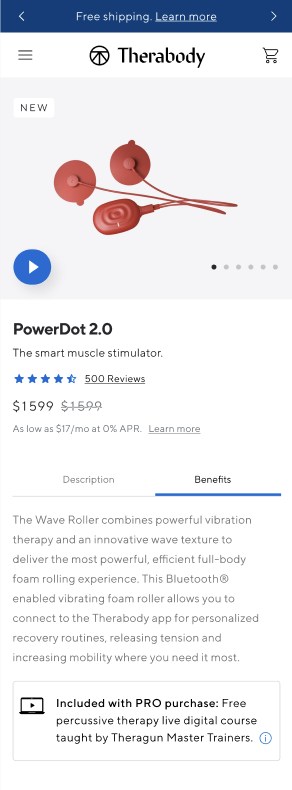
    On mobile, Heatmaps suggest that users want to be able to click certain images
    • Some images (treatments) people were wanting to interact with
    • Probably wanted to know more details about the treatments
Katelyn.szmurlo@gmail.com

Link to Facebook
Link to Instagram
Link to TikTok
Link to YouTube

Kate Szmurlo

Therabody

Product Listing Page

Role:

Freelance UX Designer

Duration:

1 year (on-going freelance)

Contribution:

Research, design, concept

Platform:

Web

The Therabody design team set out to explore new and innovative ways to improve the product listing page shopping experience. As Therabody expanded from a single hero product into a multi-product ecosystem—growing beyond the core Theragun line to include additional devices and accessories—the existing product listing page no longer scaled with the business. This growth created a need to rethink how products were organized, discovered, and compared as the catalog continued to expand.


I served as the lead designer on the exploration, partnering closely with a design researcher. Together, we ran a series of usability tests on UserTesting.com, evaluating both the existing experience (control) and new design concepts to validate improvements and guide iteration.User research surfaced several key gaps in the current experience:

  • No ability to search or filter products by body part or pain area
  • Lack of in-context visuals or videos showing products in use
  • Product overload as the catalog expanded, making it difficult to choose
  • No clear way to compare products and understand differences at a glance

Discovery

The discovery phase focused on understanding how other leading brands approach product discovery and decision-making at scale. I conducted an extensive competitive analysis across fitness, wellness, and adjacent e-commerce spaces to evaluate how competitors structured product listing pages, supported comparison, surfaced education, and reduced choice overload. By identifying common patterns, gaps, and best practices, this research helped clarify where Therabody’s experience was falling short—and where there was an opportunity to differentiate through clearer navigation, better storytelling, and more intuitive product comparison. Insights from this analysis directly informed early concepts and set a strong foundation for design exploration.

Research

I led the research efforts for this project, independently designing and executing multiple studies on UserTesting.com. This included building out research plans, crafting study objectives and questions, and setting up unmoderated interviews to evaluate both the existing experience and new design concepts. Insights from these sessions helped identify user pain points, validate design direction, and guide iteration throughout the exploration.

  • Finding 1
    Wants to see the benefits and treatments upfront
    • Most, if not all, got frustrated over not knowing clearly what the treatments and benefits were
    • Felt like the page was trying to sell them on the lifestyle more than what you get out of the product
    • Wanted to see clearly what they were buying it for
  • Finding 2
    Would like to see testimonials or reviews

    Participants were really impressed by how visually engaging the story focused concept was.


    When asked if they would be wanting to create something like this, half said they would but the other half said writing isnt for them and they would be the reader.

  • Finding 3
    On mobile, users thought it was too long of a scroll and too many images
    • The scroll on mobile becomes dramatically long
    • Many would get fatigue from scrolling so long
    • Because it was so many images, it made it impossible to scroll
    • Images were nice, very diverse, but extremely repetitive

Detail page

Role:

Freelance UX Designer

Duration:

2 weeks

Contribution:

Research, design, concept

Platform:

Web

The Therabody design team set out to explore new and innovative ways to improve the product detail page (PDP) shopping experience. As Therabody expanded from a single hero product into a multi-product ecosystem—growing beyond the core Theragun line to include additional devices and accessories—the existing PDP experience no longer scaled with the business. The page needed to evolve from a simple product overview into a decision-support tool that could help users understand, evaluate, and confidently choose the right product.


I served as the lead designer on this exploration, partnering closely with a design researcher. Together, we conducted a series of usability studies on UserTesting.com, evaluating both the existing PDP (control) and new design concepts to validate improvements and guide iteration.


Research revealed several key gaps in the PDP experience:

  • No way to discover products based on body part or pain area
  • Limited in-context imagery and video showing products in use
  • Information overload as the product catalog expanded
  • No clear way to compare products or understand key differences at a glance
  • Finding 1
    Whats included / specs should be higher up
    • Most users thought this to be very important
    • Most commented about wanting to know about warranty and return policy in the forefront (buyers assurance)
  • Finding 2
    Most really liked the how to use videos

    Participants were really impressed by how visually engaging the story focused concept was.


    When asked if they would be wanting to create something like this, half said they would but the other half said writing isnt for them and they would be the reader.

  • Finding 3
    On mobile, Heatmaps suggest that users want to be able to click certain images
    • Some images (treatments) people were wanting to interact with
    • Probably wanted to know more details about the treatments
Katelyn.szmurlo@gmail.com

Link to Facebook
Link to Instagram
Link to TikTok
Link to YouTube

Kate Szmurlo

Therabody

Product Listing Page

Role:

Freelance UX Designer

Duration:

1 year (on-going freelance)

Contribution:

Research, design, concept

Platform:

Web

The Therabody design team set out to explore new and innovative ways to improve the product listing page shopping experience. As Therabody expanded from a single hero product into a multi-product ecosystem—growing beyond the core Theragun line to include additional devices and accessories—the existing product listing page no longer scaled with the business. This growth created a need to rethink how products were organized, discovered, and compared as the catalog continued to expand.


I served as the lead designer on the exploration, partnering closely with a design researcher. Together, we ran a series of usability tests on UserTesting.com, evaluating both the existing experience (control) and new design concepts to validate improvements and guide iteration.User research surfaced several key gaps in the current experience:

  • No ability to search or filter products by body part or pain area
  • Lack of in-context visuals or videos showing products in use
  • Product overload as the catalog expanded, making it difficult to choose
  • No clear way to compare products and understand differences at a glance

Discovery

The discovery phase focused on understanding how other leading brands approach product discovery and decision-making at scale. I conducted an extensive competitive analysis across fitness, wellness, and adjacent e-commerce spaces to evaluate how competitors structured product listing pages, supported comparison, surfaced education, and reduced choice overload. By identifying common patterns, gaps, and best practices, this research helped clarify where Therabody’s experience was falling short—and where there was an opportunity to differentiate through clearer navigation, better storytelling, and more intuitive product comparison. Insights from this analysis directly informed early concepts and set a strong foundation for design exploration.

Research

I led the research efforts for this project, independently designing and executing multiple studies on UserTesting.com. This included building out research plans, crafting study objectives and questions, and setting up unmoderated interviews to evaluate both the existing experience and new design concepts. Insights from these sessions helped identify user pain points, validate design direction, and guide iteration throughout the exploration.

  • Finding 1
    Wants to see the benefits and treatments upfront
    • Most, if not all, got frustrated over not knowing clearly what the treatments and benefits were
    • Felt like the page was trying to sell them on the lifestyle more than what you get out of the product
    • Wanted to see clearly what they were buying it for
  • Finding 2
    Would like to see testimonials or reviews
    • Reviews like from doctors or people who have used the product and their before and afters
  • Finding 3
    On mobile, users thought it was too long of a scroll and too many images
    • The scroll on mobile becomes dramatically long
    • Many would get fatigue from scrolling so long
    • Because it was so many images, it made it impossible to scroll
    • Images were nice, very diverse, but extremely repetitive

Detail page

Role:

Freelance UX Designer

Duration:

2 weeks

Contribution:

Research, design, concept

Platform:

Web

The Therabody design team set out to explore new and innovative ways to improve the product detail page (PDP) shopping experience. As Therabody expanded from a single hero product into a multi-product ecosystem—growing beyond the core Theragun line to include additional devices and accessories—the existing PDP experience no longer scaled with the business. The page needed to evolve from a simple product overview into a decision-support tool that could help users understand, evaluate, and confidently choose the right product.


I served as the lead designer on this exploration, partnering closely with a design researcher. Together, we conducted a series of usability studies on UserTesting.com, evaluating both the existing PDP (control) and new design concepts to validate improvements and guide iteration.


Research revealed several key gaps in the PDP experience:

  • No way to discover products based on body part or pain area
  • Limited in-context imagery and video showing products in use
  • Information overload as the product catalog expanded
  • No clear way to compare products or understand key differences at a glance
  • Finding 1
    Whats included / specs should be higher up
    • Most users thought this to be very important
    • Most commented about wanting to know about warranty and return policy in the forefront (buyers assurance)
  • Finding 2
    Most really liked the how to use videos
    • Many liked how they can use the product.
    • Liked knowing how this product can be used in their routine
  • Finding 3
    On mobile, Heatmaps suggest that users want to be able to click certain images
    • Some images (treatments) people were wanting to interact with
    • Probably wanted to know more details about the treatments
Katelyn.szmurlo@gmail.com

Link to Facebook
Link to Instagram
Link to TikTok
Link to YouTube