
Scroll to see my work


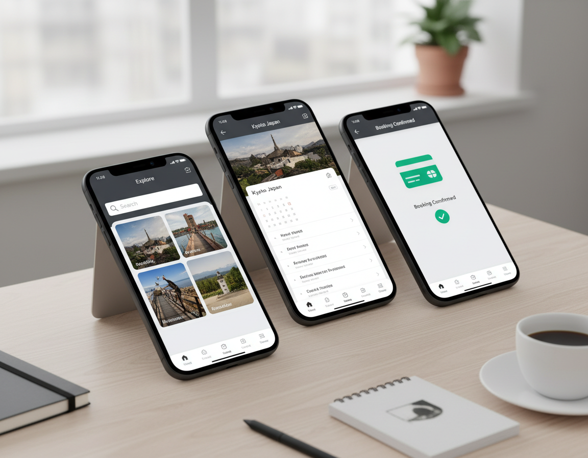


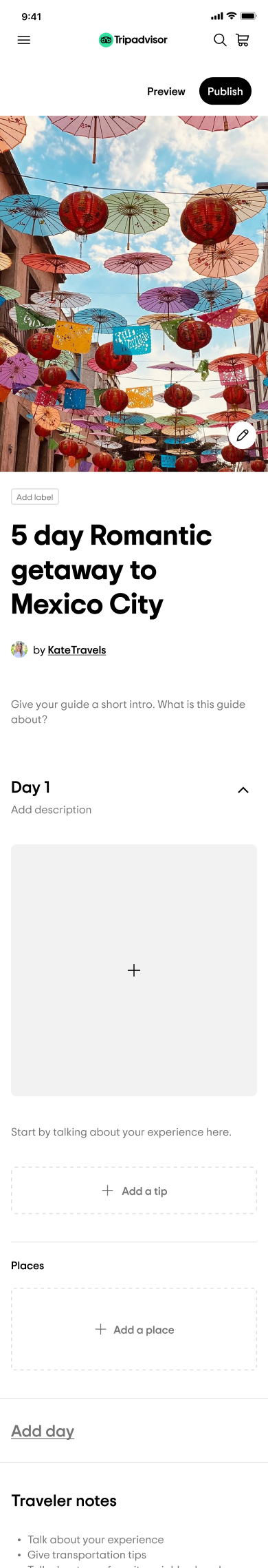
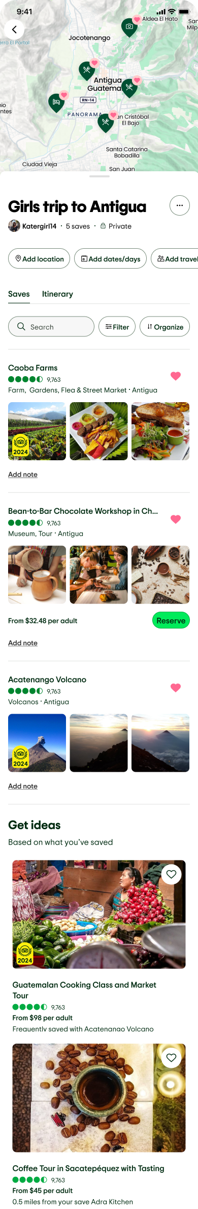
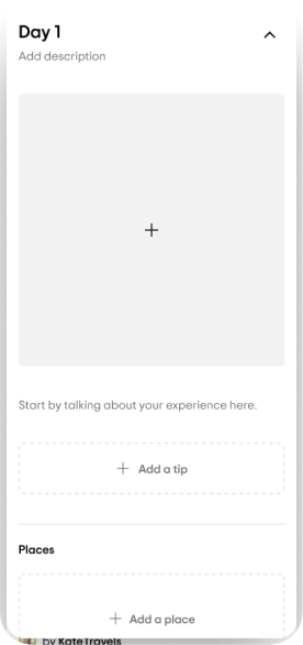
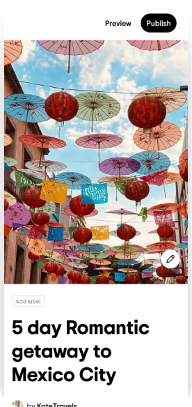
Public Trips
Landing + Detail pages
Freelance Product Designer
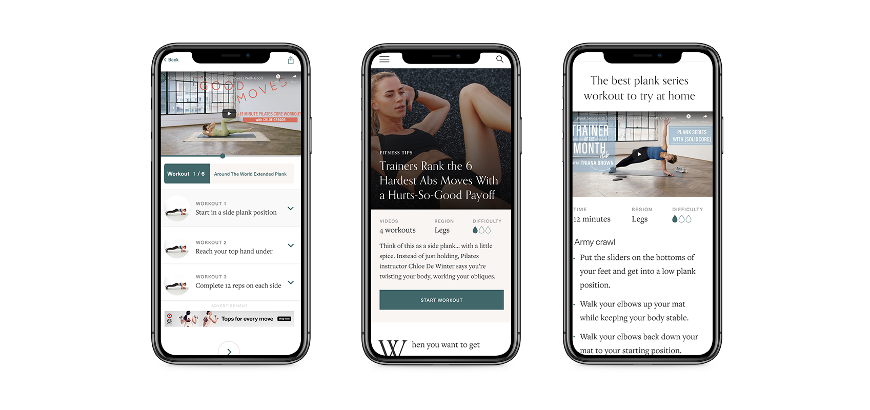
UX Testing


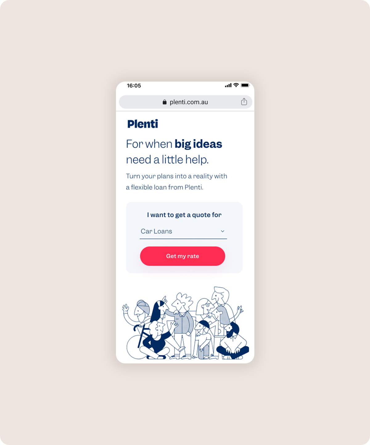
Freelance UX Designer
UX Testing
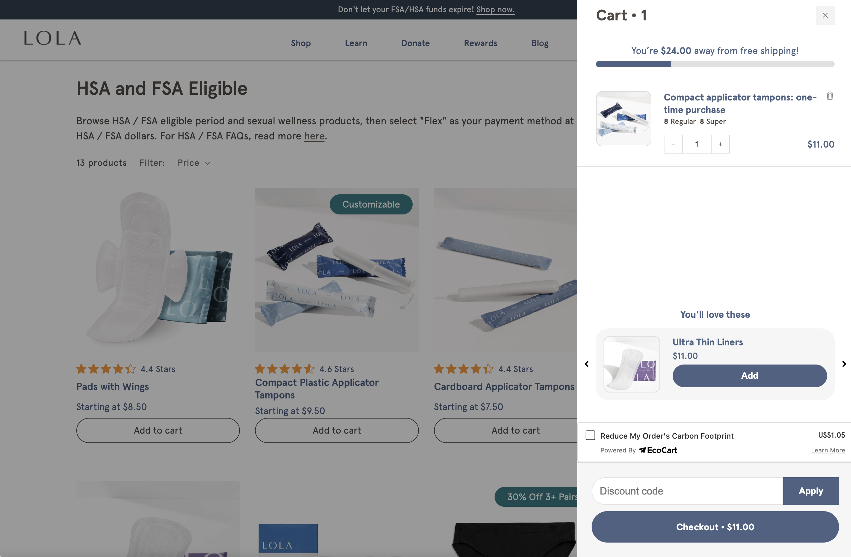
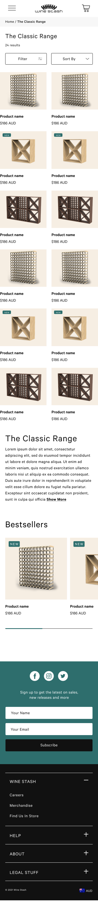
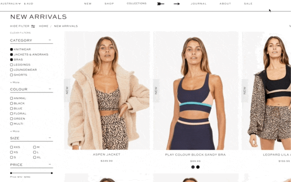
Shopping cart


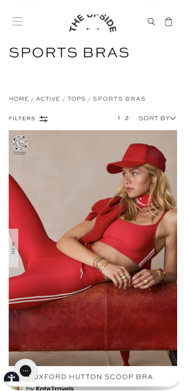
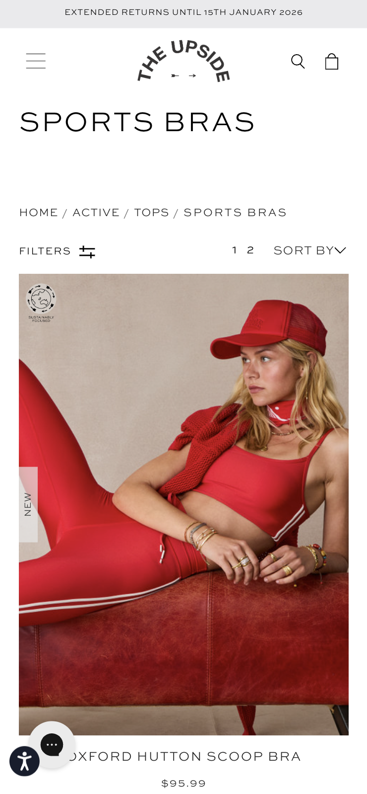
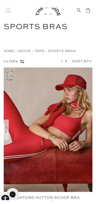
The Upside
0 to 1 build
0 to 1 Build
Oh more projects!
Design guidelines
Consistent use of stroke widths, style and metaphor is necessary for icons to feel streamlined in the design system storybook.


Do
Draw simple objects that are easy to identify.


Don’t
Embellish icons with unnecessary details.
Do
Create icons that are outlined

Don’t
Fill the icons, unless that icon has an interactive state
Do
Ensure that icons are two-dimensional, and objects face forward.

Don’t
Use perspective and 3D objects
Design Tip
When creating an icon, view and edit it at 400% (192 x 192 dp), which will display edges at 4dp.
By maintaining this ratio, any changes to the original will be scaled up or down proportionally, which preserves sharp edges and correct alignment when the scale is returned to 100% (48dp).

Do
Reuse parts of other icons in the set to maintain visual harmony across all icons.

Do
Use simple geometric shapes, angles, and rounded corners.

Don’t
Don’t scale icons outside the standard sizes.

Do
Use a consistent visual style, stroke weight and only one color.

Don’t
Use transparency.
Say hey
I’m a Denver based Senior Product Designer with a background in digital and brand design. I’ve been a lead senior product designer for Tripadvisor and love helping people travel every day.
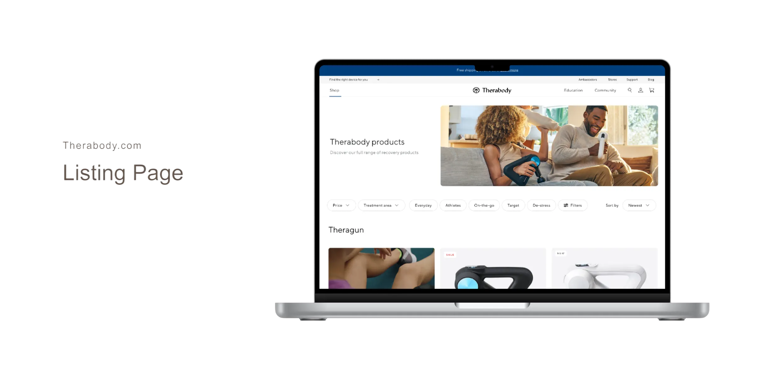
I’ve spent most of my career designing for a variety of e-commerce clients in both the United States and Australia. Some of these clients include Therabody, MyLOLA, HSBC Australia, and TheUpside.
Say hey


Kate Szmurlo
Scroll to see my work
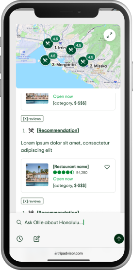
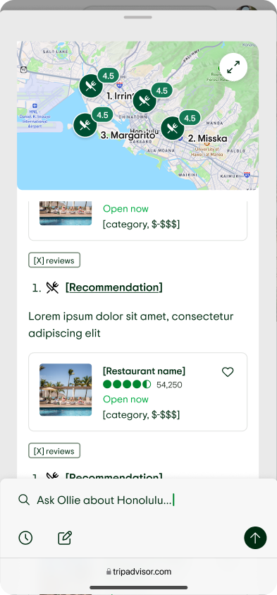
AI travel chat bot


Public Trips

Landing + Detail pages


Shopping cart


0 to 1 Build

Oh more projects!
Design guidelines
Consistent use of stroke widths, style and metaphor is necessary for icons to feel streamlined in the design system storybook.
Do
Draw simple objects that are easy to identify.
Don’t
Embellish icons with unnecessary details.
Do
Create icons that are outlined
Don’t
Fill the icons, unless that icon has an interactive state
Do
Ensure that icons are two-dimensional, and objects face forward.
Don’t
Use perspective and 3D objects
Design Tip
When creating an icon, view and edit it at 400% (192 x 192 dp), which will display edges at 4dp.
By maintaining this ratio, any changes to the original will be scaled up or down proportionally, which preserves sharp edges and correct alignment when the scale is returned to 100% (48dp).

Do
Reuse parts of other icons in the set to maintain visual harmony across all icons.
Do
Use simple geometric shapes, angles, and rounded corners.
Don’t
Don’t scale icons outside the standard sizes.
Do
Use a consistent visual style, stroke weight and only one color.
Don’t
Use transparency.
Say hey
I’m a Denver based Senior Product Designer with a background in digital and brand design. I’ve been a lead senior product designer for Tripadvisor and love helping people travel every day.
I’ve spent most of my career designing for a variety of e-commerce clients in both the United States and Australia. Some of these clients include Therabody, MyLOLA, HSBC Australia, and TheUpside.
Say hey


Kate Szmurlo
Product + UX Designer
katelyn.szmurlo@gmail.com
Available January 2026
Scroll to see my work
AI travel chat bot


Public Trips
Landing + Detail pages
Freelance Product Designer
UX Testing


Shopping cart
Freelance UX Designer
UX Testing


0 to 1 Build
The Upside
0 to 1 build
Say hey
I’m a Denver based Senior Product Designer with a background in digital and brand design. I’ve been a lead senior product designer for Tripadvisor and love helping people travel every day.
I’ve spent most of my career designing for a variety of e-commerce clients in both the United States and Australia. Some of these clients include Therabody, MyLOLA, HSBC Australia, and TheUpside.
Say hey


Kate Szmurlo
Product + UX Designer
katelyn.szmurlo@gmail.com

Available January 2026
Scroll to see my work
AI travel chat bot


Public Trips
Landing + Detail pages


Shopping cart


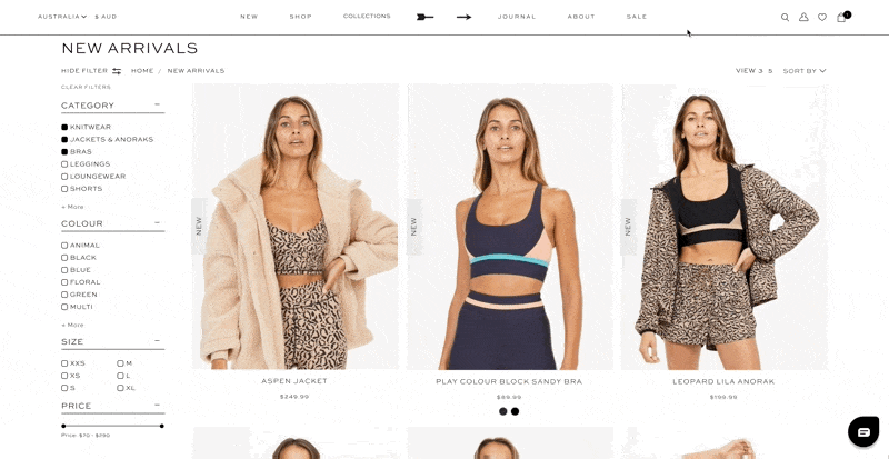


0 to 1 Build
Oh more projects!
Design guidelines
Consistent use of stroke widths, style and metaphor is necessary for icons to feel streamlined in the design system storybook.
Do
Draw simple objects that are easy to identify.
Don’t
Embellish icons with unnecessary details.
Do
Create icons that are outlined
Don’t
Fill the icons, unless that icon has an interactive state
Do
Ensure that icons are two-dimensional, and objects face forward.
Don’t
Use perspective and 3D objects
Design Tip
When creating an icon, view and edit it at 400% (192 x 192 dp), which will display edges at 4dp.
By maintaining this ratio, any changes to the original will be scaled up or down proportionally, which preserves sharp edges and correct alignment when the scale is returned to 100% (48dp).
Do
Reuse parts of other icons in the set to maintain visual harmony across all icons.
Do
Use simple geometric shapes, angles, and rounded corners.
Don’t
Don’t scale icons outside the standard sizes.
Do
Use a consistent visual style, stroke weight and only one color.
Don’t
Use transparency.
Say hey
I’m a Denver based Senior Product Designer with a background in digital and brand design. I’ve been a lead senior product designer for Tripadvisor and love helping people travel every day.
I’ve spent most of my career designing for a variety of e-commerce clients in both the United States and Australia. Some of these clients include Therabody, MyLOLA, HSBC Australia, and TheUpside.
Say hey


Kate Szmurlo

Product + UX Designer
katelyn.szmurlo@gmail.com
Available January 2026
Scroll to see my work
AI travel chat bot
Public Trips
Landing + Detail pages
Shopping cart
0 to 1 Build
Oh more projects!
Design guidelines
Consistent use of stroke widths, style and metaphor is necessary for icons to feel streamlined in the design system storybook.

Do
Draw simple objects that are easy to identify.
Don’t
Embellish icons with unnecessary details.

Do
Create icons that are outlined
Don’t
Fill the icons, unless that icon has an interactive state
Do
Ensure that icons are two-dimensional, and objects face forward.
Don’t
Use perspective and 3D objects
Design Tip
When creating an icon, view and edit it at 400% (192 x 192 dp), which will display edges at 4dp.
By maintaining this ratio, any changes to the original will be scaled up or down proportionally, which preserves sharp edges and correct alignment when the scale is returned to 100% (48dp).
Do
Reuse parts of other icons in the set to maintain visual harmony across all icons.
Do
Use simple geometric shapes, angles, and rounded corners.
Don’t
Don’t scale icons outside the standard sizes.
Do
Use a consistent visual style, stroke weight and only one color.
Don’t
Use transparency.
Say hey
I’m a Denver based Senior Product Designer with a background in digital and brand design. I’ve been a lead senior product designer for Tripadvisor and love helping people travel every day.
I’ve spent most of my career designing for a variety of e-commerce clients in both the United States and Australia. Some of these clients include Therabody, MyLOLA, HSBC Australia, and TheUpside.
Say hey
Kate Szmurlo